Here’s a quick userstyle for the Gmail loading screen. You and apply it via Stylish. Edit: And a Chrome/Chromium extension!
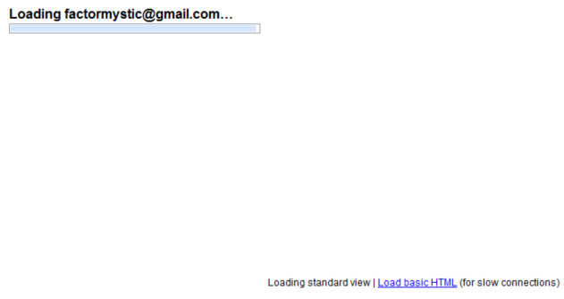
It’s takes you from boring…

Gmail Loading Screen (Before)
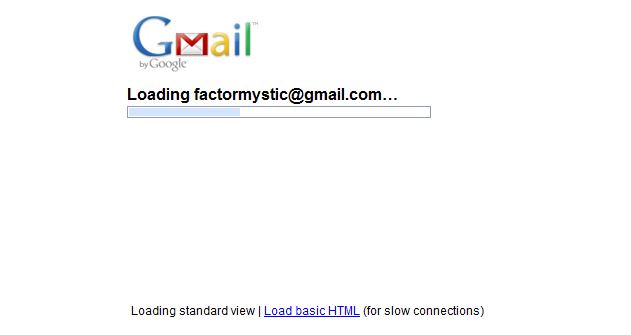
…to moderately less boring!

Gmail Loading Screen (After)
It’s cool how just centering the info and adding a logo spruces things up. Take the hint, Google!
Here’s the code:
@namespace url(http://www.w3.org/1999/xhtml);

@-moz-document domain("mail.google.com") {
  #loading {
    position: absolute;
    left: 50%;
    width: 400px;
    margin-left: -200px;
  }
  #loading .cmsg:first-child {
    background-image: url(https://mail.google.com/mail/images/2/5/logo1.png);
    background-position: left top;
    background-repeat: no-repeat;

    padding-top: 70px;
  }
  #stb {
    left:0px;
  }
}
Ideas to make it cooler? Leave a comment!